
Wix Logo Maker lets you create a professional logo in under 10 minutes by answering a few questions about your brand and then customizing the AI-generated designs it produces. You do not need any design experience - the tool handles layout, color matching, and icon selection based on your inputs, and you can fine-tune every element before downloading.
This guide covers the full process from start to finish, plus design tips, file format advice, platform-specific sizing, and industry-specific recommendations that most other tutorials skip.
- Wix Logo Maker guides you through the process - answer a few questions about your brand and get AI-generated logo options in minutes.
- Keep your logo simple - stick to 2-3 colors, one or two fonts, and a clean icon for the most professional result.
- You can customize everything - colors, fonts, icons, and layout can all be adjusted after selecting an initial design.
- Download the right formats - PNG for web, SVG for print and scaling, JPG for email signatures and documents.
How to Use Wix Logo Maker: Step-by-Step Tutorial
The entire process of creating a logo with Wix takes about 5-10 minutes. The tool uses your answers to a series of questions to generate logo designs tailored to your brand. Here is how to make a logo on Wix from start to finish.
Step 1: Access Wix Logo Maker
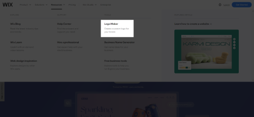
Start by going to Wix and finding the Logo Maker option in the navigation menu. You can also search for "Logo Maker" using the site's search bar. The tool is separate from the main website builder, so make sure you are clicking into the logo-specific section rather than the general site editor.
Tip: Bookmark the Logo Maker page so you can return to it easily if you want to create additional logos or revisit your designs later.
Step 2: Create or Log Into Your Wix Account
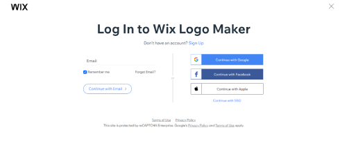
If you already have a Wix account, log in with your email or social account. If you are new to Wix, create a free account - you can sign up with your email address, Google, Facebook, or Apple. Creating an account is required so that your logo designs are saved and you can return to edit them later.
Tip: Use the same account you plan to build your website with. This way, your logo integrates directly into your Wix site without extra steps.
Step 3: Start Your Logo Project
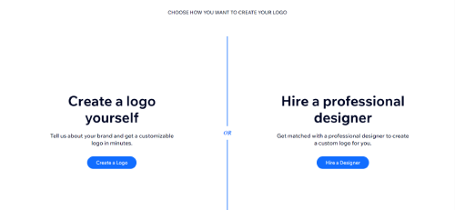
You will see two options: "Create a Logo" (design it yourself using the AI-guided tool) or "Hire a Designer" (get matched with a professional). For this Wix logo design tutorial, select "Create a Logo" to use the self-service tool. After clicking, the Logo Maker begins a short guided questionnaire about your brand.
Tip: Even if you think you might want a professional designer eventually, try the self-service tool first. It is free to explore, and the generated designs can serve as inspiration or a starting point for a designer.
Step 4: Select Your Industry
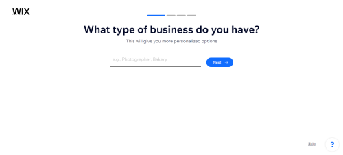
Choose the industry that best matches your business or project. Wix uses this information to filter its icon library and suggest design styles that are common in your field. For example, selecting "Restaurant" will surface food-related icons and warm color palettes, while "Technology" leans toward geometric shapes and cooler tones.
Tip: Be specific. If your business spans multiple industries, pick the one that best describes what customers see first. A yoga studio that also sells products online should select "Fitness" rather than "E-commerce" for more relevant logo suggestions.
Step 5: Describe Your Brand's Style
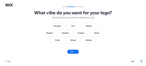
Wix Logo Maker will present a set of style adjectives like "Creative," "Modern," "Playful," "Bold," or "Dynamic." Select the words that best describe how you want your brand to feel. You can pick multiple options, and the tool uses your choices to determine font styles, color palettes, and icon treatments.
Tip: Think about your target audience rather than your personal taste. A children's clothing brand benefits from "Playful" and "Fun," even if you personally prefer minimalist design. The logo needs to resonate with the people who will see it most.
Step 6: Enter Your Brand Name and Tagline
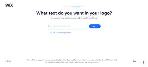
Type in your brand or business name exactly as you want it to appear on your logo. If you have a tagline or slogan, add that too - it will appear as smaller text beneath or beside your brand name in the generated designs.
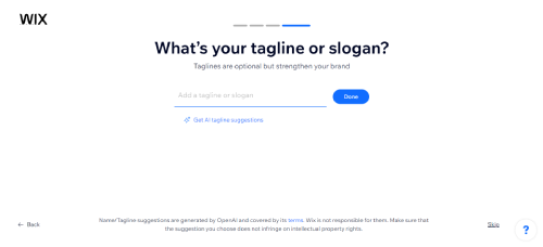
Tip: Keep your tagline short - three to five words works best. Long taglines become unreadable at small sizes. If you are not sure about your tagline, leave it blank for now. You can always add it during customization.
Step 7: Review Generated Logo Designs
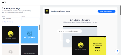
Based on everything you entered, Wix Logo Maker generates a page of logo options. Scroll through all of them before making a decision - there are usually dozens of variations. Pay attention to overall layout and feel rather than getting stuck on specific colors or fonts, since you can change those in the next step.
Tip: If none of the generated logos feel right, go back and adjust your style preferences or industry selection. Small changes to your inputs can produce very different results.
Step 8: Customize Your Selected Logo
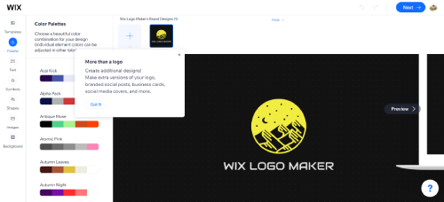
After selecting a logo, the editor opens where you can fine-tune every element. You can change the color palette, swap fonts, replace the icon, adjust text size and spacing, and reposition elements. This is where your logo goes from a template to something that feels like yours.
What you can customize:
- Colors: Change background, text, and icon colors independently
- Fonts: Browse Wix's font library and preview different typefaces on your logo - if you want to go further, see our guide on uploading custom fonts on Wix
- Icons: Search for alternative icons or remove the icon entirely for a text-only logo
- Layout: Switch between horizontal, stacked, and icon-only arrangements
- Size and spacing: Adjust the relative size of text, icon, and tagline elements
Tip: Less is more during customization. Resist the urge to add multiple colors and decorative fonts. The most memorable logos are clean and simple.
Step 9: Refine Your Logo
Before finalizing, take a step back and review your logo with fresh eyes. Check how it looks at different sizes - zoom out to see if it is still recognizable as a small favicon, and zoom in to make sure details are clean. Preview it on a light background and a dark background to confirm it works in both contexts.
Tip: Show your logo to a few people and ask them what kind of business they think it represents. If their answer does not match your actual business, consider adjusting the colors, icon, or font to better communicate your brand.
Step 10: Download Your Logo
Once you are satisfied, click the download button. Wix will present its pricing packages. The free option gives you a low-resolution sample, while paid plans provide high-resolution files in multiple formats suitable for print and web use.
Tip: If you are unsure whether to purchase, download the free sample first and place it on your website mockup or social media profile to see how it looks in context. You can always come back and purchase the high-resolution version later.
Step 11: Implement Your Logo
With your logo downloaded, start placing it across your brand's touchpoints. Add it to your website header, social media profiles, email signature, business cards, and any marketing materials. Consistency is key - use the same logo version everywhere so your audience recognizes your brand instantly.
Tip: Save your logo files in a dedicated "Brand Assets" folder on your computer or cloud storage. Include different versions (full color, white, dark background) so you always have the right file ready when you need it. If you are designing a website with Wix, your logo will integrate directly into the site builder.
Logo File Formats: PNG vs SVG vs JPG
Wix Logo Maker provides your logo in PNG, JPG, and SVG formats (SVG is only available on the Advanced plan). Each format serves a different purpose, and picking the wrong one can make your logo look blurry, oversized, or unprofessional. Here is when to use each one.
PNG - Best for Websites and Social Media
PNG files support transparent backgrounds, which means your logo can sit on top of any color without a white box around it. Use PNG for your website header, social media profiles, email signatures, and any digital application where the background color might vary. The downside is that PNG files are raster-based (made of pixels), so they lose quality if you enlarge them beyond their original resolution.
SVG - Best for Print and Scaling
SVG is a vector format, meaning your logo is stored as mathematical shapes rather than pixels. You can scale an SVG file to any size - from a business card to a billboard - without losing sharpness. Use SVG for print materials (business cards, flyers, signage), merchandise (t-shirts, mugs), and anywhere you need the logo at a size larger than what was originally exported. SVG files also tend to be smaller than high-resolution PNGs.
JPG - Best for Documents and Email
JPG files are widely compatible and load quickly, but they do not support transparent backgrounds (your logo will always sit on a white or colored rectangle). Use JPG for inserting your logo into Word documents, PDFs, PowerPoint presentations, and email signatures in clients that do not support PNG transparency well. Avoid JPG if you need your logo on a non-white background.
Which Formats Should You Download?
If budget allows, get the Advanced plan so you have all three formats. At minimum, you need PNG for web use. If you plan to print business cards, order signage, or put your logo on physical products, SVG is essential - you cannot get a clean print from a low-resolution PNG. Keep all your logo files organized in one folder with clear naming (e.g., "logo-full-color.png", "logo-white.svg").
Logo Sizing for Different Platforms
One of the most common mistakes after creating a logo is uploading it at the wrong size and watching it appear stretched, cropped, or pixelated. Here are the specific pixel dimensions you need for the most common placements.
- Website header: 250 x 60 pixels to 400 x 100 pixels (horizontal layout works best)
- Favicon: 32 x 32 pixels or 16 x 16 pixels - use just the icon portion of your logo, not the full wordmark. See our guide on adding a favicon to your Wix site for the full process
- Facebook profile picture: 170 x 170 pixels (displays at 176 x 176 on desktop)
- Instagram profile picture: 320 x 320 pixels (displays at 110 x 110)
- X (Twitter) profile picture: 400 x 400 pixels
- LinkedIn company logo: 300 x 300 pixels
- YouTube channel icon: 800 x 800 pixels
- Email signature: 200-300 pixels wide, keep height proportional
- Business card print: use SVG or a PNG at minimum 300 DPI (roughly 1050 x 600 pixels for a standard card)
Tip: Always create the icon-only version of your logo for square placements like social media profile pictures. The full horizontal logo with your business name will be unreadable at 110 pixels wide. During the Wix Logo Maker customization step, switch to the "icon only" layout and save that as a separate file.
Industry-Specific Logo Tips
The industry you select in Wix Logo Maker affects the icons and styles you see, but the tool cannot tell you what actually works for your specific market. Here are practical recommendations for common business types.
Restaurants and Food Businesses
Avoid generic fork-and-knife icons - every restaurant uses them. Instead, choose an icon that reflects your specific cuisine or atmosphere (a steaming bowl for ramen, a wheat stalk for a bakery, a flame for BBQ). Warm colors like red, orange, and deep brown stimulate appetite and feel welcoming. Stick to one or two clean fonts - script fonts can work for upscale dining but should be legible above all else.
Professional Services (Law, Finance, Consulting)
Conservative colors like navy blue, dark gray, and forest green communicate trust and stability. Skip playful icons - use abstract geometric shapes, initials, or a clean wordmark with no icon at all. Serif fonts signal tradition and authority, while a modern sans-serif can work for firms that want to appear approachable. Avoid bright colors or cartoon-style icons, which can undermine credibility.
Creative and Design Businesses
Your logo is a portfolio piece itself, so it needs to demonstrate good taste. Paradoxically, the best approach is still simplicity - a unique color choice, a distinctive font, or a clever use of negative space. Avoid using too many colors or overly complex illustrations that look busy at small sizes. Sans-serif and display fonts work well here.
Health and Wellness
Green, teal, and soft blue tones communicate calm, health, and nature. Leaf or plant icons are overused in this space - consider abstract shapes that suggest growth or balance without being literal. Clean, rounded fonts feel friendly and approachable. Avoid sharp, aggressive typography or dark color palettes that create a clinical rather than welcoming mood.
E-commerce and Retail
Your logo will appear on product packaging, shipping labels, and a small browser tab. Test it at every size during design. Bold, clear fonts that read well at both large and tiny sizes are essential. If you sell a specific product category, a subtle icon reference can work - but a strong wordmark alone is often more memorable and versatile for retail.
Logo Design Tips for Beginners
The Wix Logo Maker gives you the tools, but knowing a few design principles will help you create a logo that actually looks professional. Here are the fundamentals that separate polished logos from amateur ones.
Keep It Simple
The most recognizable logos in the world - Nike, Apple, Target - are extremely simple. A good logo should be identifiable at a glance, even at the size of a social media profile picture. Avoid cramming multiple icons, gradients, or detailed illustrations into your design. Stick to one clear symbol or a clean wordmark.
Use 2-3 Colors Maximum
Color is one of the most powerful branding tools, but more colors do not mean a better logo. Choose one primary brand color and one or two supporting colors. Consider what emotions different colors evoke: blue communicates trust and professionalism, red conveys energy and urgency, green suggests nature and growth, and black signals sophistication and luxury.
Pick Fonts That Match Your Brand Personality
Fonts carry personality. Serif fonts (with small lines at the ends of letters) feel traditional and established. Sans-serif fonts feel modern and clean. Script fonts feel personal and creative but can be hard to read at small sizes. Avoid using more than two fonts in your logo - one for your brand name and optionally one for your tagline.
Design for All Sizes
Your logo will appear on everything from billboard-sized headers to tiny favicons. Test your design at multiple sizes during customization. If the details disappear when the logo is small, simplify the design. A good rule of thumb: if your logo does not look clear at 50 pixels wide, it is too complex.
Make It Versatile
Your logo should work on light backgrounds, dark backgrounds, and colored surfaces. During the Wix Logo Maker customization step, preview your logo on different backgrounds. If it only looks good on white, consider adding a subtle outline or choosing colors with stronger contrast.
Common Mistakes to Avoid When Using Wix Logo Maker
Knowing what not to do is just as important as following the right steps. Here are the most common mistakes people make when creating a logo with Wix, and how to avoid them.
Choosing a Trendy Design Over a Timeless One
Design trends change every year, but your logo should last for years. Avoid overly trendy elements like extreme gradients, overly thin fonts, or design styles that are popular right now but will look dated in two years. Aim for a design that will still feel relevant five years from now.
Using Too Many Elements
The customization editor makes it tempting to add more - another color, a tagline, a larger icon. Resist this urge. Every element you add competes for attention and makes your logo harder to recognize at small sizes. If you find yourself adding things, try removing elements instead and see if the logo improves.
Ignoring How the Logo Looks in Black and White
There will be situations where your logo appears without color - fax documents, single-color printing, or embossed materials. If your logo relies entirely on color to be recognizable, it needs more work on shape and contrast.
Skipping the Industry Selection Step
Some users rush through the questionnaire and pick a random industry. This directly affects the quality of your generated designs. Take 30 seconds to choose the right category, and you will get far better starting options to work with.
Not Comparing Enough Options
Many users click on the first logo that looks decent. Scroll through all the generated options before deciding. Sometimes the best design is further down the page. You can also re-run the generator with slightly different style preferences to see a completely new set of options.
Downloading Only One File Format
Many users grab just the PNG and call it done. Months later, they need their logo for a print order or a large banner and realize the PNG looks pixelated when scaled up. Always download the SVG if your plan includes it - this gives you a file that can be resized to any dimension without quality loss. If you skipped SVG, you may end up re-creating your logo from scratch.
Forgetting to Create an Icon-Only Version
Your full logo with the business name looks great on a website header, but it is unreadable as a 32-pixel favicon or social media avatar. During customization, switch to the icon-only layout and export that version separately. You will need it for favicons, app icons, watermarks, and any square-format placement.
Can You Trademark a Logo Made with Wix?
Yes, you can file a trademark application for a logo created with Wix Logo Maker, but there are important limitations to understand before you invest in the process.
Wix's paid plans grant you full commercial usage rights to your logo, meaning you are allowed to use the logo for business purposes. However, commercial usage rights and trademark rights are not the same thing. A trademark protects a specific mark as an identifier of your brand in commerce - it prevents others from using a confusingly similar logo in your industry.
The potential issue is that Wix Logo Maker uses a shared library of icons and design elements. If another business creates a logo using the same icon in a similar arrangement, your trademark could face challenges. Trademark examiners also look at how distinctive a mark is - highly generic logos built from common template elements may be harder to register.
Practical steps if you plan to trademark:
- Customize the icon heavily during the design step - change colors, adjust proportions, and combine elements in a way that feels distinct rather than using a stock icon as-is
- Consider using a wordmark (text-only) logo, since your business name itself is more likely to be unique and trademarkable than a template icon
- Run a trademark search on the USPTO website (or your country's equivalent) before filing to check if a similar mark already exists in your category
- Budget $250-$350 per class for the USPTO filing fee, plus attorney fees if you use one (recommended for first-time filers)
- If your brand grows and trademark protection becomes critical, consider hiring a designer to create a fully custom logo that has no shared elements with template libraries
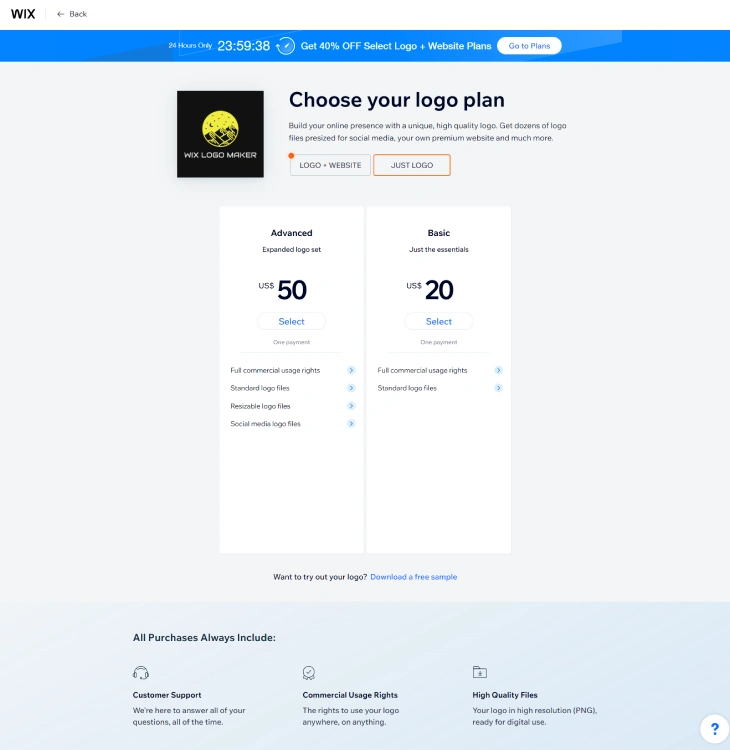
Wix Logo Maker Pricing
Wix offers two standalone logo plans: the Basic plan at $20 (one-time payment) which includes standard logo files with full commercial usage rights, and the Advanced plan at $50 (one-time payment) which adds resizable SVG files, social media-optimized versions, and a brand kit.
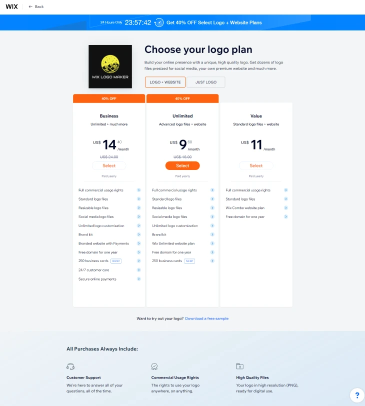
If you also need a website, Wix bundles logo design with their website plans starting at $9/month. For a full breakdown of what each plan includes and whether the free option is enough for your needs, see our detailed guide on whether Wix Logo Maker is free. You can also compare it against other logo tools in our Wix Logo Maker vs Tailor Brands breakdown.
Wix Logo Maker vs Hiring a Designer
Wix Logo Maker works best for businesses that need a decent logo quickly and affordably - startups on a tight budget, side projects, or businesses that want to launch now and invest in professional branding later. For $20-$50, you get a usable logo in under 15 minutes.
The trade-off is originality. Because Wix uses a shared icon and template library, there is a chance that another business ends up with a logo that looks similar to yours. For local businesses or niche markets where you are unlikely to overlap with competitors, this is rarely an issue. For brands entering crowded markets where visual identity is a major differentiator, a custom-designed logo from a professional designer ($300-$2,000+) gives you something no one else has.
A practical middle ground: start with Wix Logo Maker to get your brand off the ground, then invest in a professional redesign once your business generates enough revenue to justify the cost. Many successful brands started with a simple logo and upgraded later. For users exploring other website building options, it may be worth comparing Wix's best website templates to see if the platform is the right fit before investing in a logo.
Common Wix Logo Maker Problems and How to Fix Them
Even with a simple tool, users run into specific issues that the Wix help center does not address clearly. Here are the most common Wix Logo Maker problems and their fixes:
Colors Look Different After Downloading
If your logo colors appear slightly different in the downloaded file compared to what you saw on screen while designing, this is almost always a color space issue. Wix Logo Maker uses RGB color values, which are optimized for screens. When you open the downloaded file in print software (like Adobe Illustrator or CorelDRAW), the software may convert it to CMYK, which shifts some colors, especially highly saturated blues, greens, and reds.
The fix: if you are using the logo for print, download the SVG version and use software that lets you manage color profiles. For digital use (web, social media, email), the PNG or JPG download will look exactly as expected because your display uses RGB by default.
SVG File Not Opening Correctly
Some design programs and older web browsers have limited SVG compatibility. If your SVG logo opens with missing elements or incorrect rendering, try these steps: open the SVG in a plain text editor and check for any references to external fonts (these may not load outside of Wix's environment). If you need a fully self-contained vector file, open the SVG in Inkscape (free) and re-save it as a "plain SVG" or "optimized SVG" to flatten any embedded dependencies.
The Icon You Want Is Not Available
Wix Logo Maker's icon library is curated rather than exhaustive. If you cannot find an icon that matches your brand, you have two practical options: (1) Upload a custom icon as a PNG element within the logo editor. Go to the icon selection step, click "Upload," and add your own image. The icon will be treated as a raster image layer, not a vector, which limits scaling at very large sizes. (2) Download your logo without an icon (text-only version), then combine it with a separate icon file in a design tool like Canva or Adobe Express.
Logo Subscription Expired: Can You Still Use Your Logo?
Yes. Once you have paid for and downloaded your Wix logo files, you own them permanently. Your right to use the logo does not expire when your Wix Logo Maker subscription ends. The subscription covers the ability to download high-quality files and access the editor to make further changes. If your subscription expires, you lose access to re-downloading or editing the logo from Wix's platform, but all previously downloaded files remain yours to use indefinitely.
Download Quality Looks Low
If your downloaded PNG looks pixelated, you are likely on the free plan, which provides a low-resolution PNG (300px x 300px or similar). To get a high-resolution PNG suitable for printing or large-format use, you need the Basic plan at minimum. The Professional plan provides the highest resolution files plus the SVG for unlimited scaling. If you only need the logo for a website or social media profile picture, the free download quality is usually sufficient for small display sizes.
Wix Logo Maker Free vs Paid: What You Actually Get
Wix Logo Maker lets you design a logo for free, but downloading high-quality files requires a paid plan. Here is exactly what each tier provides:
| Feature | Free | Basic ($20 one-time) | Professional ($50 one-time) |
|---|---|---|---|
| Design and preview your logo | Yes | Yes | Yes |
| Low-res PNG download | Yes | Yes | Yes |
| High-res PNG (print quality) | No | Yes | Yes |
| SVG (vector, unlimited scaling) | No | No | Yes |
| Social media logo kit | No | No | Yes (pre-sized for each platform) |
| Full commercial use rights | No | Yes | Yes |
| Re-edit logo in Wix editor | No | Yes | Yes |
The free plan is useful for previewing designs and deciding if you like the direction before committing. If you are launching a real business, the Basic plan ($20 one-time) is the practical minimum: it gives you a high-resolution PNG for print and digital use, commercial rights, and the ability to re-edit your logo later. The Professional plan makes the most sense if you need an SVG for merchandise, signage, or large-format printing where resolution matters.
One thing worth noting: Wix Logo Maker pricing is a one-time purchase, not a monthly subscription. You pay once and receive permanent download access and edit rights for that logo. This is different from services like Looka or Tailor Brands, which charge monthly for continued access to your logo files. If budget is a constraint, Wix Logo Maker's one-time pricing model is a significant advantage.
Who Owns a Logo Made with Wix Logo Maker? AI Copyright Explained
Before you use your Wix logo on business cards, merchandise, or legal documents, it helps to understand what you actually own.
Wix's Position on Logo Ownership
According to Wix's terms of service, once you download your paid logo, you receive a license to use the logo commercially. Wix does not claim ownership of logos you create. The paid download gives you the right to use the files across your business materials, websites, social media, signage, and printed items.
Can You Trademark a Wix Logo?
This is where it gets more complicated. In many jurisdictions, including the United States, copyright protection does not automatically apply to AI-generated content because there is no human author. The US Copyright Office has stated that AI-generated images without substantial human creative input are not eligible for copyright protection.
What this means practically: the specific combination of icon, colors, font, and text you chose in Wix Logo Maker may not be protectable by copyright. A competitor could use the same icon from Wix's library with different colors and text, and you would have limited legal recourse.
Trademarking your logo is different from copyright, and it is possible to trademark a logo regardless of how it was made, as long as it is distinctive enough. However, if your Wix logo uses a generic icon that thousands of other businesses also have access to, the trademark examiner may reject it as not sufficiently distinctive.
How to Strengthen the Legal Standing of Your Wix Logo
If legal ownership matters for your business, take these steps:
- Add your own custom elements. If you hire a designer to modify the Wix-generated logo, those modifications introduce human authorship and improve protectability.
- Use a unique custom font or hand-lettered text. Replacing the standard font with a custom or licensed typeface makes the logo more distinctive.
- Consult a trademark attorney before filing. A trademark attorney can tell you whether your specific logo is likely to pass the distinctiveness test before you pay filing fees.
- Document your customization process. Screenshot each step of your logo design decisions. This record of human creative choices strengthens any future claims.
The Practical Reality for Small Businesses
For most small businesses and solopreneurs, these copyright nuances rarely matter in practice. If you are building a local service business, an online shop, or a personal brand, a Wix logo is a perfectly legitimate starting point. The risks around AI copyright become more relevant if you plan to scale nationally, license your brand, or compete in a space where another company might challenge your branding.
If your brand will eventually be worth protecting, treat the Wix logo as a starting point and invest in custom design work once your business grows enough to justify it.
Making the Most of Wix Logo Maker
Wix Logo Maker is one of the fastest ways to create a professional-looking logo without any design experience. By following this step-by-step tutorial and applying the design tips above, you can build a logo that genuinely represents your brand - not just a generic placeholder.
The key takeaway: spend your time on the customization step, keep your design simple, and always test your logo at multiple sizes before finalizing. Download at least the PNG format for web use, and get the SVG if you have any plans for print materials. Wix Logo Maker provides both free and paid options, so you can explore the tool at no cost and only pay when you are ready to download the final high-resolution files.
* read the rest of the post and open up an offer